WordPress Development w/ Divi and Elementor Frameworks
Disclaimer: This information is provided with the permission of the client. I use a noindex tag and refer to them as SVWNY to further prevent indexing.
Client
SVWNY is a children’s music school that offers music lessons for kids 3-18 using the Suzuki Method.
Design Problem
The owner had a ton of great content on the original site, but it lacked Information Architecture and User Centered Design. The clutter and disorganization created confusion for visitors. The site needed to clearly communicate the school’s offerings to potential families and help current families find the info they need quickly.
Team
Business Owner
Business Advisor
User Groups
Potential clients
Currently enrolled families
Communities including
the local music education community
the Suzuki Method community more broadly
local area community
Design Process
User Research
Information Architecture
Design/
Wireframing
Visual Design
User Research
User Research: Methods & Findings
Methods
Interview with business owner
Interview with two parents of students
Interviews with friends with children to get the perspective of potential customers
Review of Suzuki music school websites in other areas
Findings
Owner:
Owner wanted to cut down on phone calls and emails about routine information such as lesson plans, event info, etc.
Currently enrolled families:
Business owner was very familiar with this audience based on frequent interactions with parents: homework, schedules, lesson plans, etc.
Potential customers:
Harder to research. The budget did not allow for recruiting people through an agency.
I interviewed several friends with children to see what they look for when researching music lessons and other activities for their kids.
The interviews with current families revealed important details about what sold them on the school.
Community Building:
She also wanted to build a reputation in the Suzuki community and the local area.
Reviews of Suzuki schools in other areas revealed strategies for communicating with broader communities
Personas
In the world of kids’ activities, the Suzuki Method is unique in that it requires parents to participate in the lessons with their kids. So the business owner had frequent and deep interactions with parents. I researched family needs further by interviewing two parents.
Generally speaking, they:
Had the financial means to provide enrichment opportunities for their kids
Lived in some specific cities in her area
Were very involved in the education of their kids
Had high hopes for their kids and their achievements in life
Were frequently on the go and use their phones to look up information such as schedules, snow closings, etc.
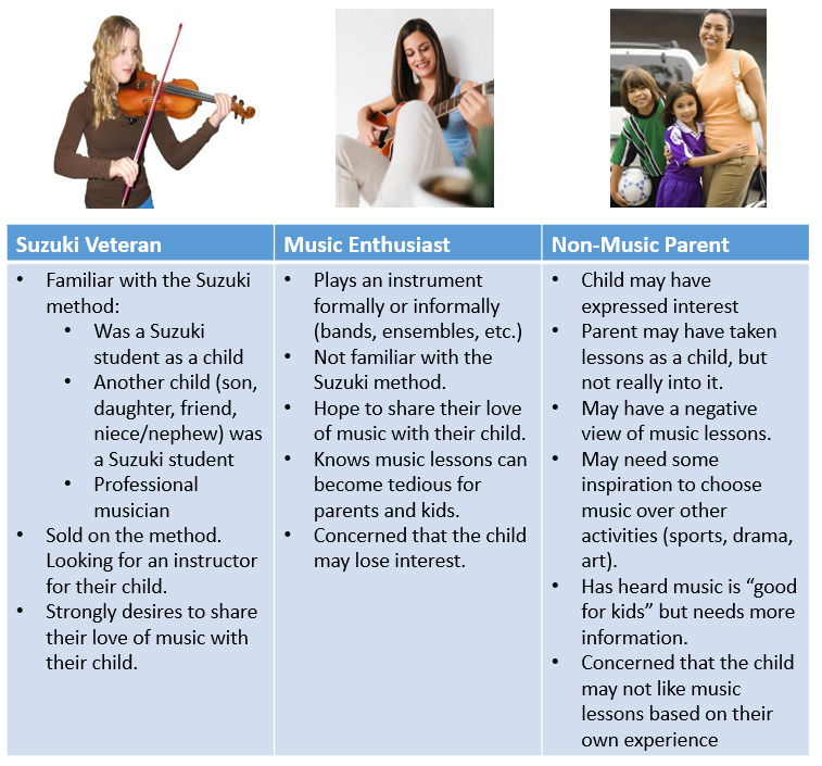
Those data points formed a base portrait but I wanted to take the concept further. Personas helped us further define and think about her audience, especially potential families. I broke her potential customers down in to three categories and we brainstormed their key features as they relate to their kids activities:
Parents familiar with the Suzuki Method and already sold on it
Music enthusiast parents that either don’t know about the Suzuki Method or aren’t sold on it
Parents with no musical background
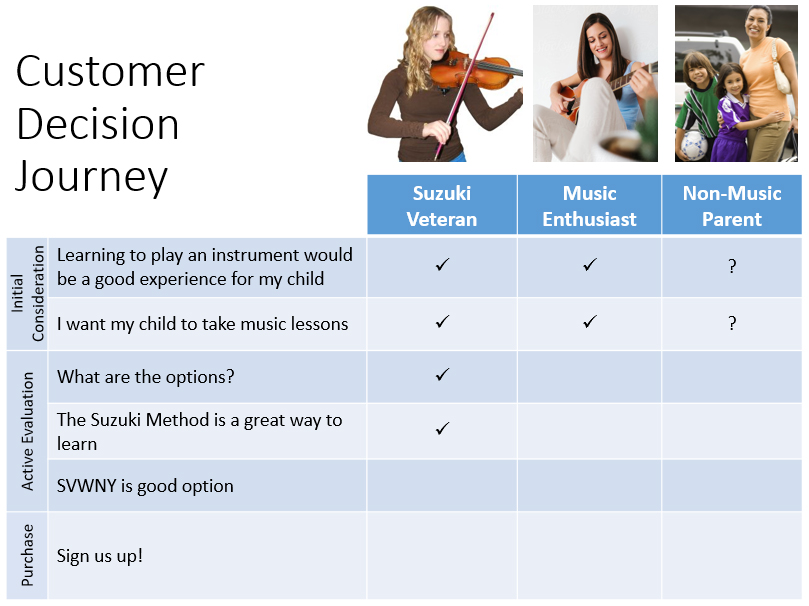
Customer Decision Journey
To highlight the differences between selling to the three groups, I created a “customer Decision Journey” that illustrated the mental journey each person would have to take before signing up. Combining this with the personas illustrated how each audience began at a different place in that journey and what messages needed to be communicated to each. These personas informed later digital marketing work as well.
The Customer Decision Journey shows the mental decisions made and where each group is in that journey when they come to the site
Information Architecture
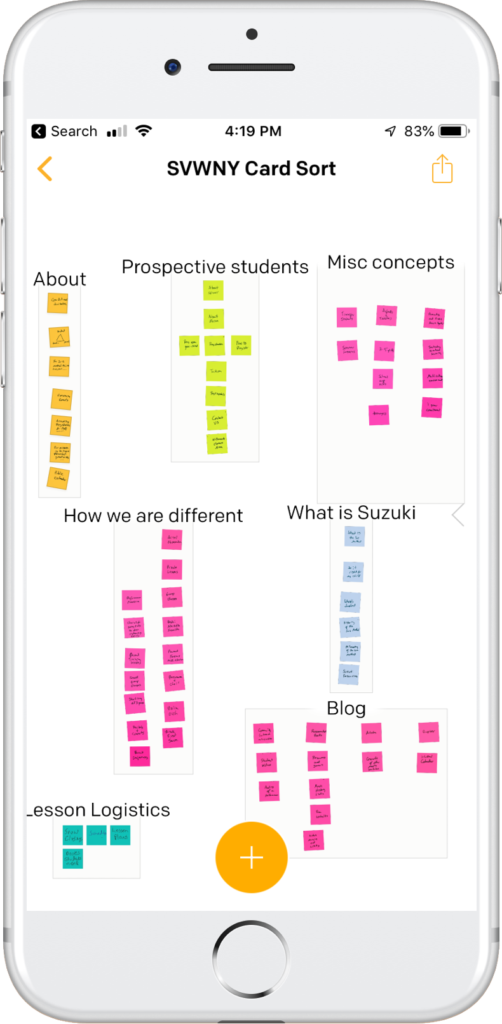
To catalog and re-organize the info on the site, I used a card sort with Post It notes and the Post it Note app on a tablet. Every piece of information on the current site went on a post it note and I sorted them into categories.
Website Sections
Info designed to sell the school to new parents
Info for current students
A treasure trove of miscellaneous info (video and photos from concerts & recitals, online music resources, local music events, etc.) relevant to current families as well as potential customers. Some of this information also served to build the school’s reputation in the Suzuki community and the local area.
Main Website Sections
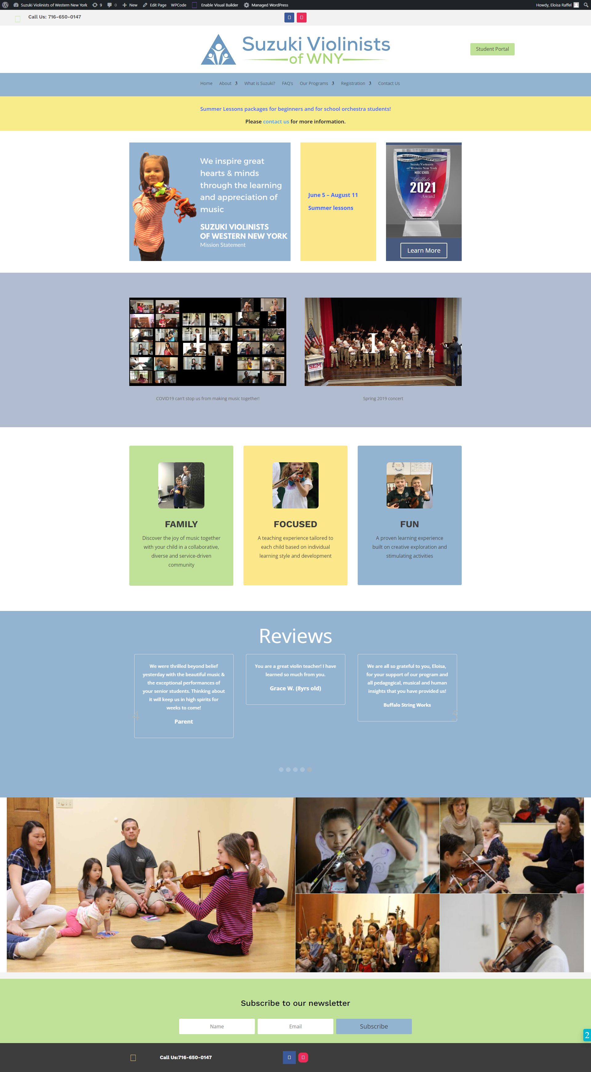
Home Page: contained most of sales info, such as value proposition, what made SVWNY different along with calls to action such as sign up, etc.
Additional Public Pages: these contained deeper information linked from the home page, such as an explanation of the Suzuki Method, tuition info, directions, etc.
Student Portal: Info for current families went into a password protected “student portal” that contained lessons, reference materials, calendar of events, etc.
Blog: Finally, I used the blogging structure of WordPress to organize the miscellaneous information. This allows the business owner to keep building up this resource, but post categories and tags keep it organized. The blog posts are accessible through a section on the main menu called “Notes.”
Card sort of content from existing site
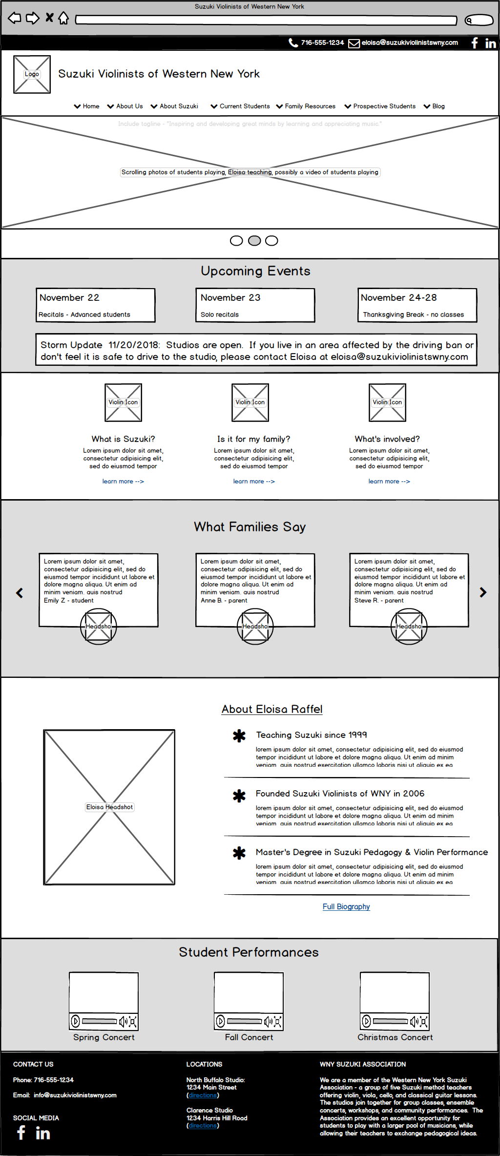
Design/Wireframing
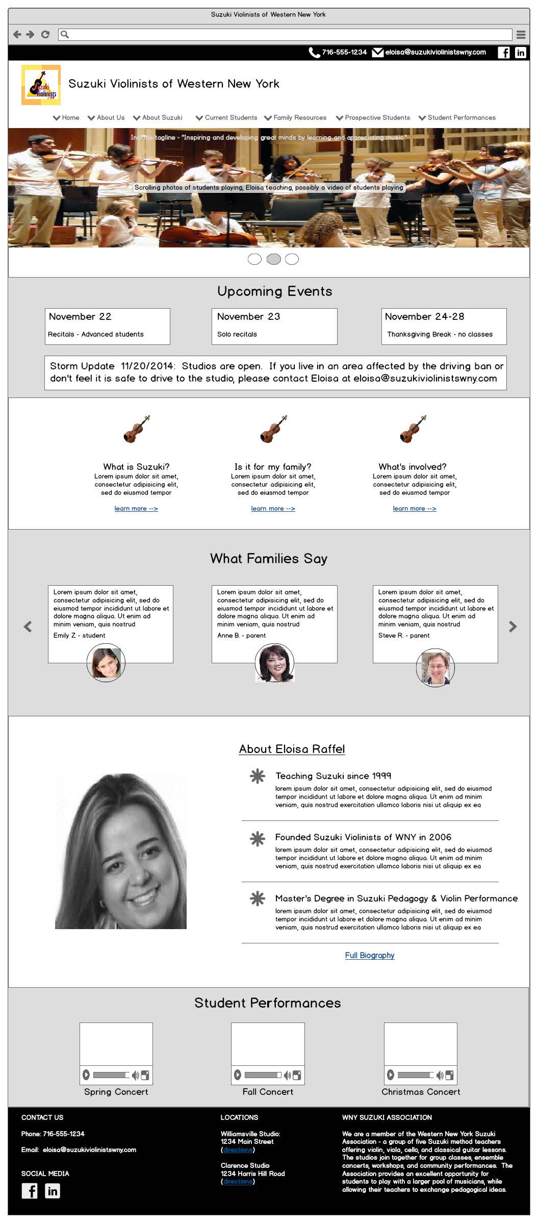
I created a wireframe just for the home page and a sample sub-page. The goal was to prompt the business owner to think about her site in an organized way. We worked through several iterations in Balsamiq. Eventually it became more efficient to design as I built pages in WordPress.
I worked with the business owner to create a simple, yet appealing visual design. I’m not a visual designer, but can create simple interfaces when budgets don’t allow for a more advanced approach. In this case it worked.
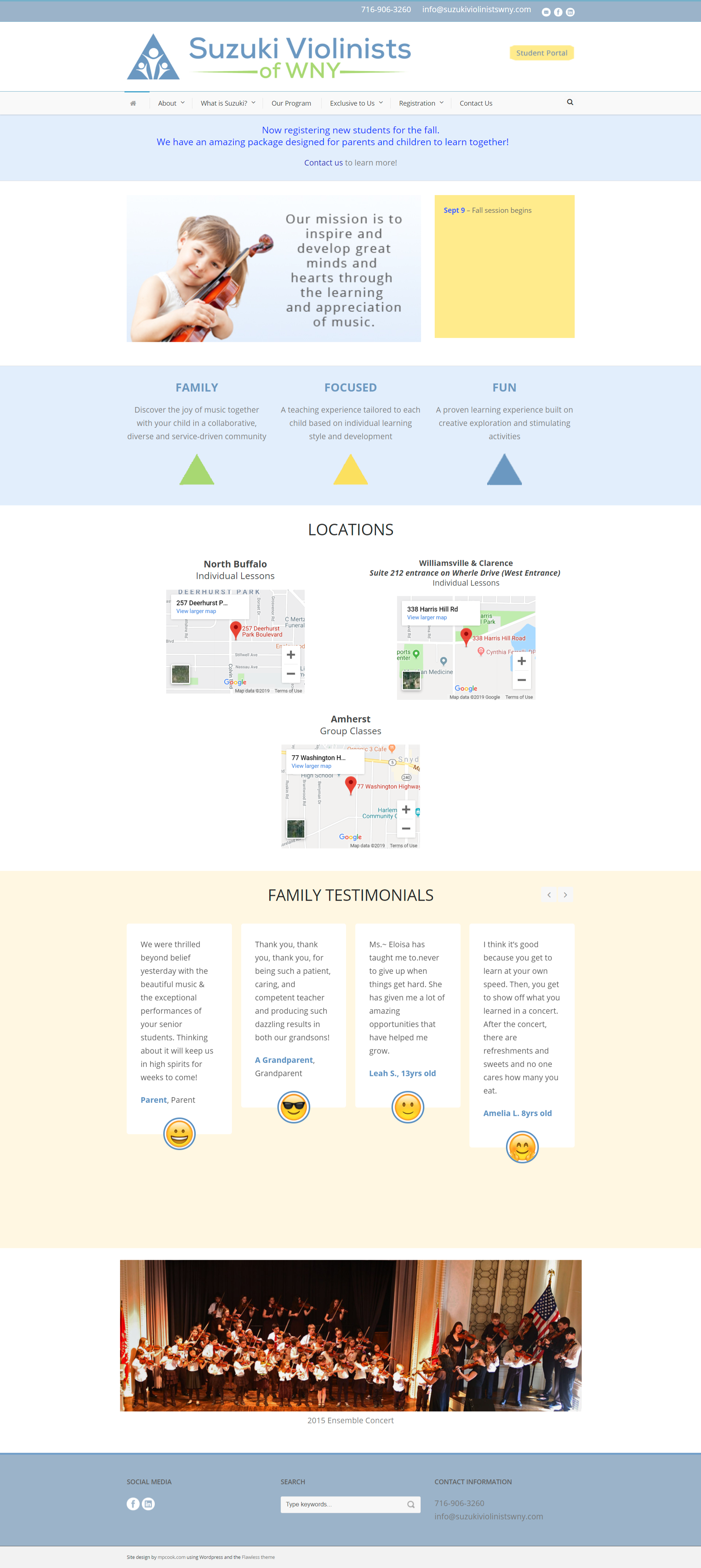
We settled on a light blue color scheme with green and yellow highlights. Blue is associated with warmth, calm, tranquility and understanding. I hired a logo designer on fiverr.com and integrated the new logo into the site.
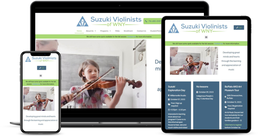
The website has gone through several redesigns to keep it fresh.
Like many websites, multiple interests competed for attention on the home page. In this case, it was the need to communicate with current families (snow closings, schedules, etc.) vs the need to sell the studio to potential families. Although we included a password-protected student portal for current families, we found that they still expected to see urgent information such as snow closings on the home page.
We compromised by posting the schedule next to hero slider at the top of the home page. I also added a temporary banner for snow closings that can be turned off when the school re-opens.
Educating the Business Owner on UX Principles
Throughout the project, I made a point of slowing down and explaining my design decisions. My hope was not only to seek buy-in but to educate the business owner on design principles. She knew her audience and had an excellent sense for compelling content. Educating her on why the information needed to be organized effectively went a long way towards her keeping the site clean and useful. Similarly, I explained why a call to action needs to be obvious and how headers help people absorb a message even if they don’t read the page.